European calligraphy
objective: Students will write in the style of calligraphy, a poem, verse, text, or quote.
|
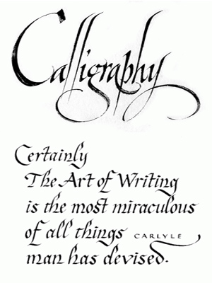
history:Calligraphy is a visual art related to writing. It is the design and execution of lettering with a broad tip instrument, brush, among other writing instruments. A contemporary calligraphic practice can be defined as, "the art of giving form to signs in an expressive, harmonious, and skillful manner".
Modern calligraphy ranges from functional inscriptions and designs to fine-art pieces where the letters may or may not be readable. Classical calligraphy differs from typography and non-classical hand-lettering, though a calligrapher may practice both. Calligraphy continues to flourish in the forms of wedding and event invitations, font design and typography, original hand-lettered logo design, religious art, announcements, graphic design and commissioned calligraphic art, cut stone inscriptions, and memorial documents. It is also used for props and moving images for film and television, testimonials, birth and death certificates, maps, and other written works. |
steps:
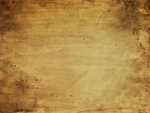
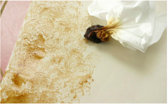
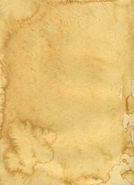
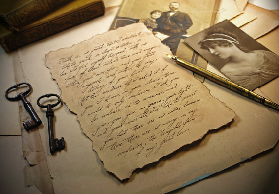
First, we will be staining paper in class to create an authentic background for your calligraphy. The images below show you examples of what your project will resemble.
|
|
|
Once you've made a few sheets of stained paper (extra in case you mess up on your final draft) you will let them dry on the drying rack. All students are required to try at least 1. Coffee Stain 2. Tea Stain and 3. Paint Stain. See which technique you like best!
important vocabulary
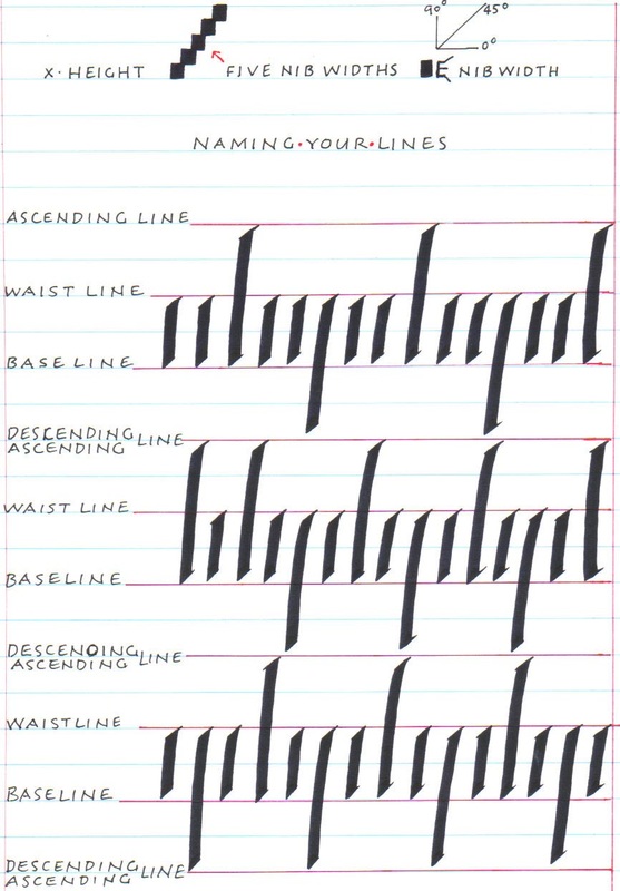
Baseline-this is home base, the writing line, the line that all the letters sit on, a place you always return to in order to find your way, think of it as safe haven, we can depend on it, like we depend on the sun. It keeps us grounded. Waistline-this line is above the baseline, the space between the baseline and waistline changes according to the x-height of the letter. The body of the lower case letters sit between waist and base. That means if you look across a line of writing you will read between waist and base. Try it with any line of writing, cover the ascenders and descenders and see that you can read the words without ascenders or descenders. Ascender-this is the line that all your ascending letters look for, except the letter t. This rule also applies to what you are reading right now. The lowercase t is it’s own height. The ascending line keeps your ascenders related to one another in terms of height. Descender-this is the line that all your descending letters gravitate to. Some thought to the fact that the descending line, for the next line of text becomes the ascending line. This keeps your ascenders from running into your descenders. This is an important consideration for any envelope addressing or page layout. Cap Height-well, they fit between the waistline and the ascending line. This difference is split halfway, you will likely need to draw or add this line onto your page. Nib- |
|
the video below is a great way to understand the way lines are used in calligraphy.
Next, PRACTICE, PRACTICE, PRACTICE!
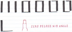
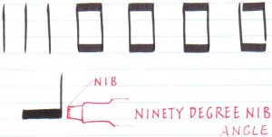
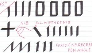
You will need to find the correct angle to hold your pen/nib at. This is very IMPORTANT.
You want to hold your tip at 45 degree angle. To illustrate this format, see the photographs below.
You will need to find the correct angle to hold your pen/nib at. This is very IMPORTANT.
You want to hold your tip at 45 degree angle. To illustrate this format, see the photographs below.
|
|
|
PEN (Nib) ANGLE, a very easy nib angle to find is 45 degrees, with a pencil draw a right angle, place your nib in the corner and let it slide upwards to cut the right angle in half, you should see a very thin stroke, see if you can retain this nib angle as you pull down. Try a plus sign, both horizontal and vertical lines will be equal in weight if you are holding onto 45 degree pen angle, remember gripping does not hold the angle, being conscious keeps the angle in place. Now see how many shapes you can make at a 45 degree pen angle.
PEN HOLD, the thumb and the first finger are considered the grippers and the middle finger is the resting finger, the staff of the pen should rest between the first two knuckles, not in the crease of your hand. Pen hold should be comfortable not cramp inducing. Practice as if you are ‘learning to walk’, quite the feat!
PEN HOLD, the thumb and the first finger are considered the grippers and the middle finger is the resting finger, the staff of the pen should rest between the first two knuckles, not in the crease of your hand. Pen hold should be comfortable not cramp inducing. Practice as if you are ‘learning to walk’, quite the feat!
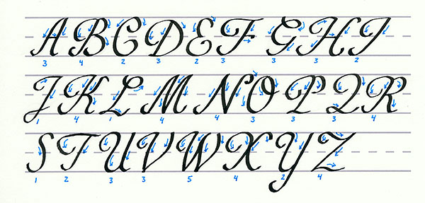
Start with the alphabet, identify your strongest and weakest characters. Then move onto your name, birthday, and 3 words that describe you.
Next, try to write a complete sentence or phrase. Remember hints and tips given in class.
Next, try to write a complete sentence or phrase. Remember hints and tips given in class.
Finally, decide on the actual poem, phrase, quote, or lyric you will be choosing. This will need to be approved and should be motivational or inspirational.
Draw out guidelines to help you write straight, and measure your words on a separate sheet of paper. You can try to write lightly in pencil prior to writing in calligraphy on your final draft.
Draw out guidelines to help you write straight, and measure your words on a separate sheet of paper. You can try to write lightly in pencil prior to writing in calligraphy on your final draft.
This is a great website for beginners: http://calligraphyforbeginners.com/
